urbanphes  —  Juanma Jiménez  —  Digital Designer

UI - Concept - UX - Print - 2015/Currently

Carto

Turns your location data into business outcomes

Carto, the Location Intelligence platform. It leads the world of Location Intelligence and Data Visualization, providing the capacity to any organization and person to extract key information from geolocalized data. Converts your location data into business results.

I am currently working on Carto as a product designer and in all this time, I have gone on to develop from desktop applications, commercial websites, posters, events, and even some other map.

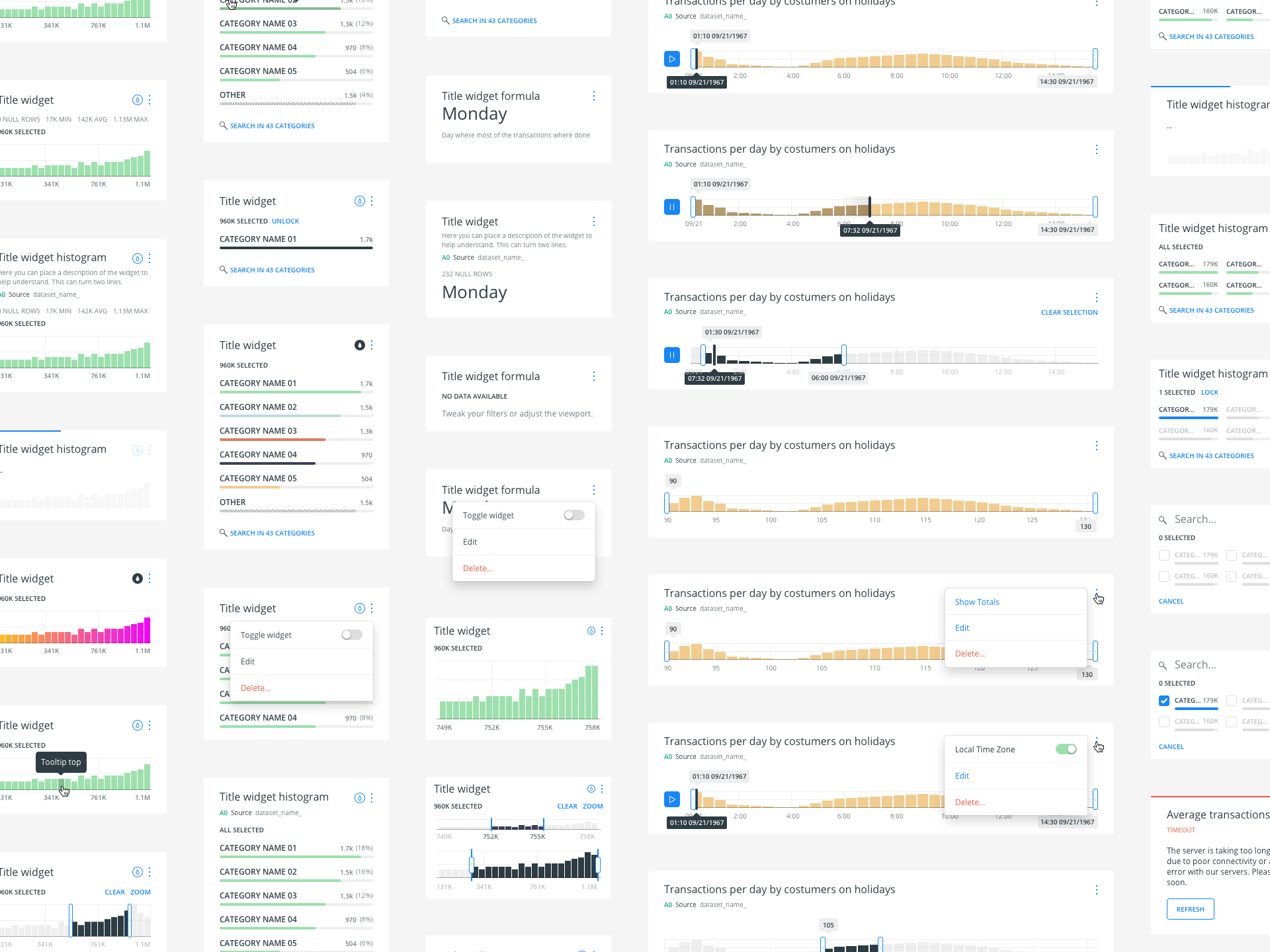
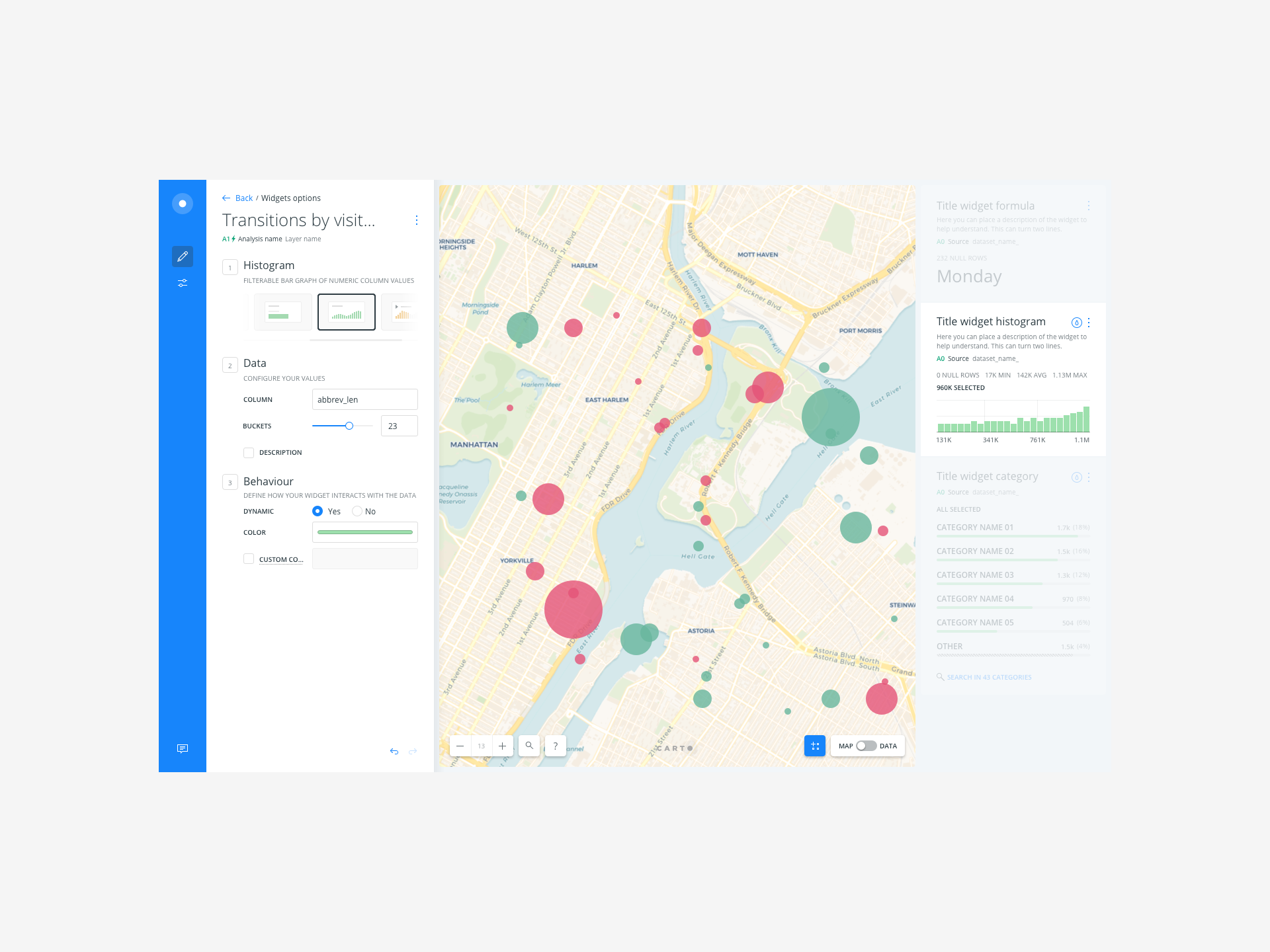
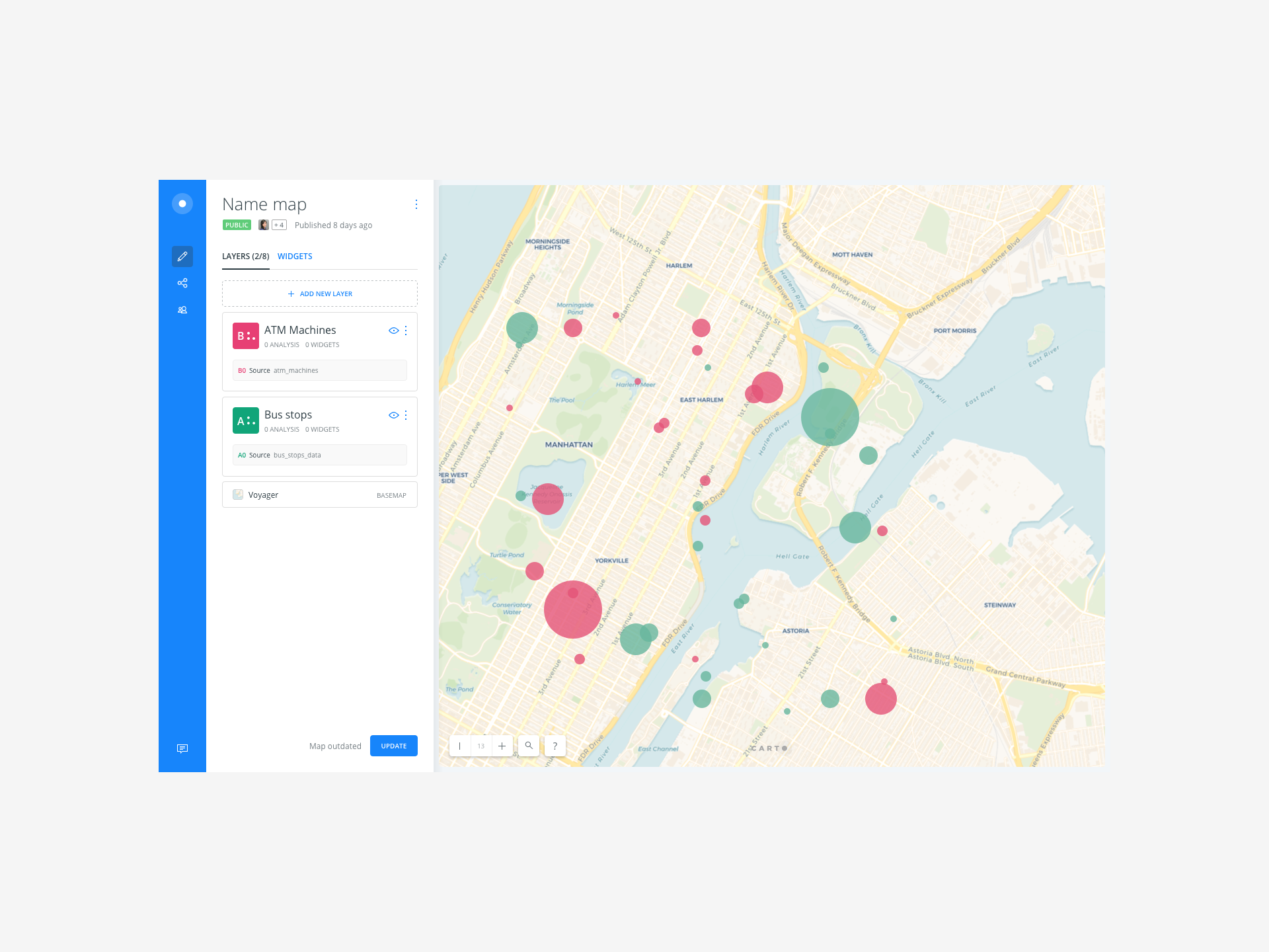
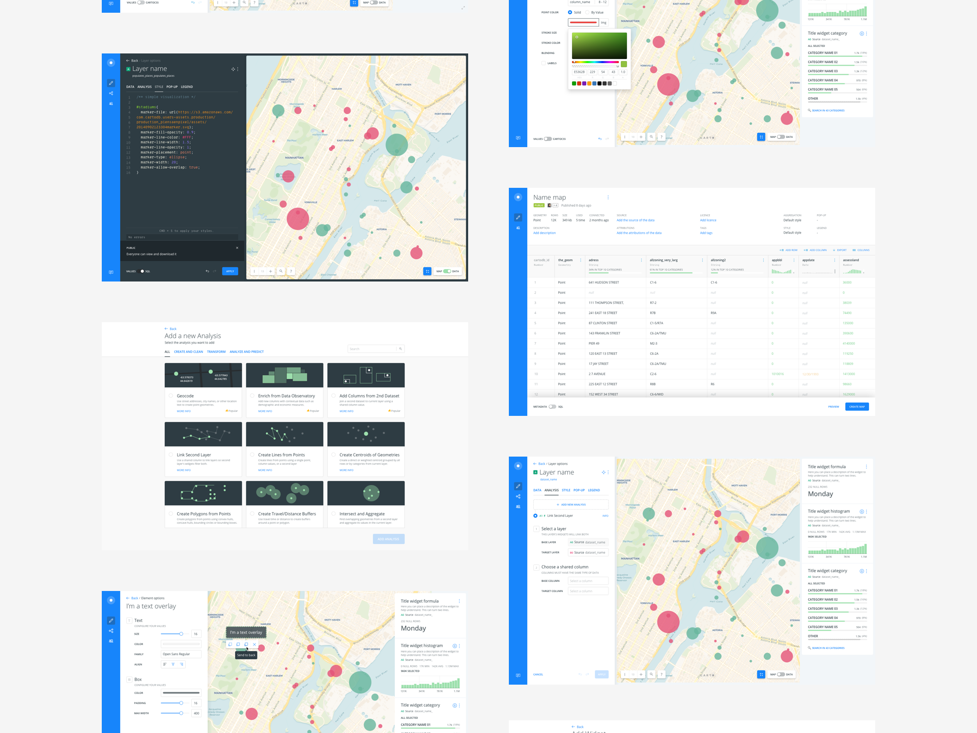
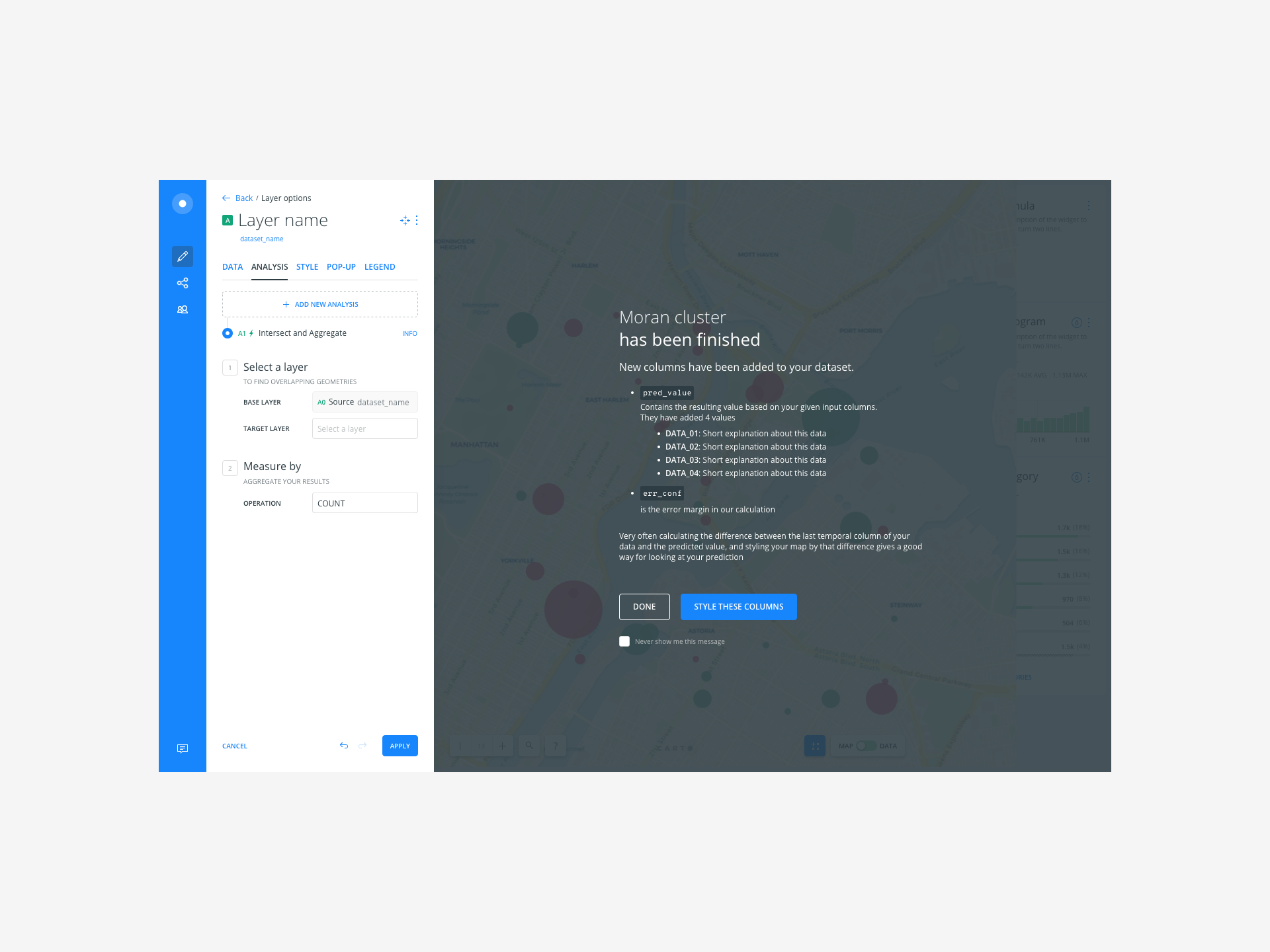
Thanks to the team that we have formed have come out projects as interesting as Builder; The tool in which you can dump your geolocalized data and be able to see at a glance how they are geographically ordered. Besides, you can do analysis and enrich it with external data. In this project we have systematized from the beginning, to gain coherence and homogeneity.

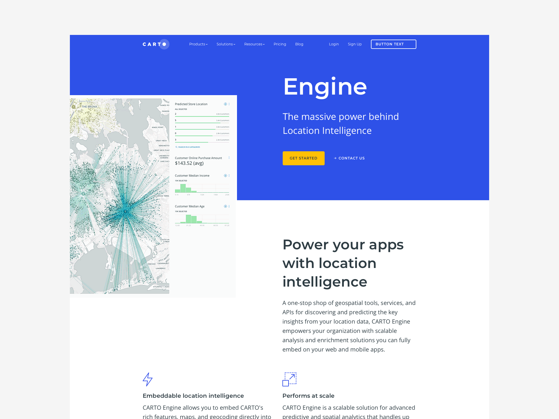
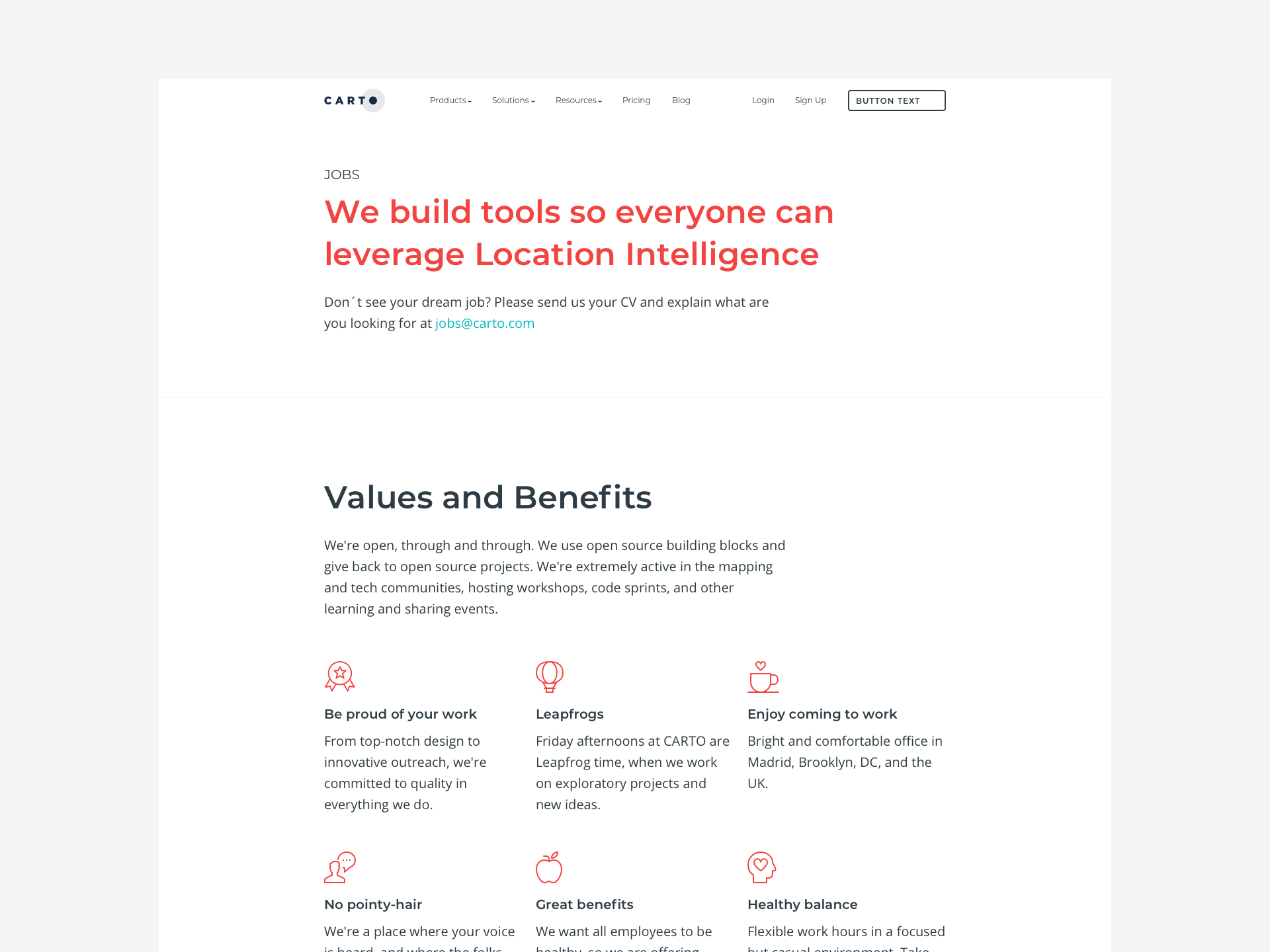
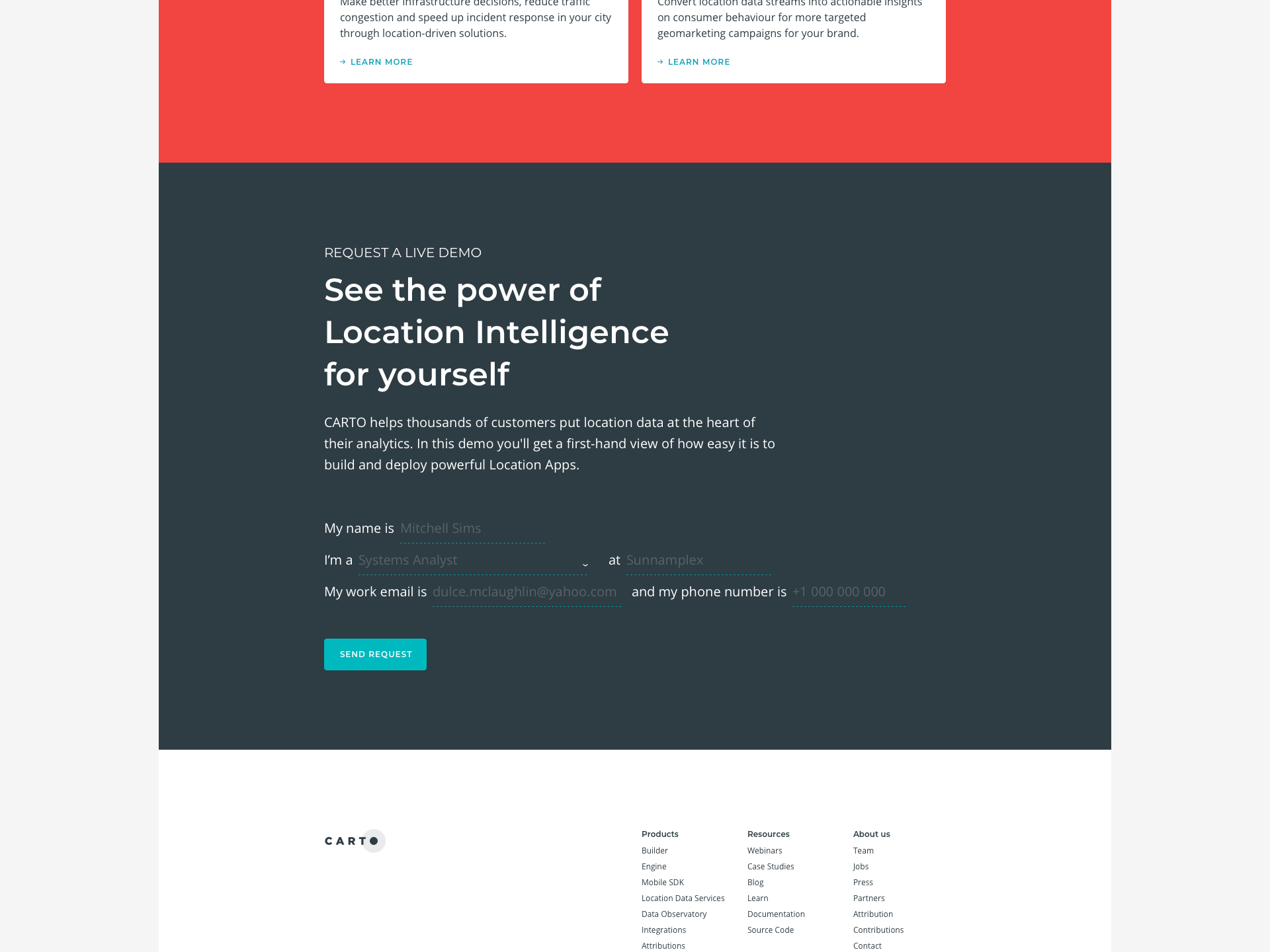
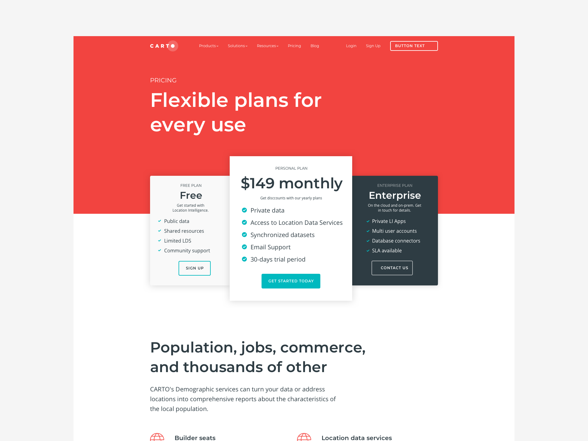
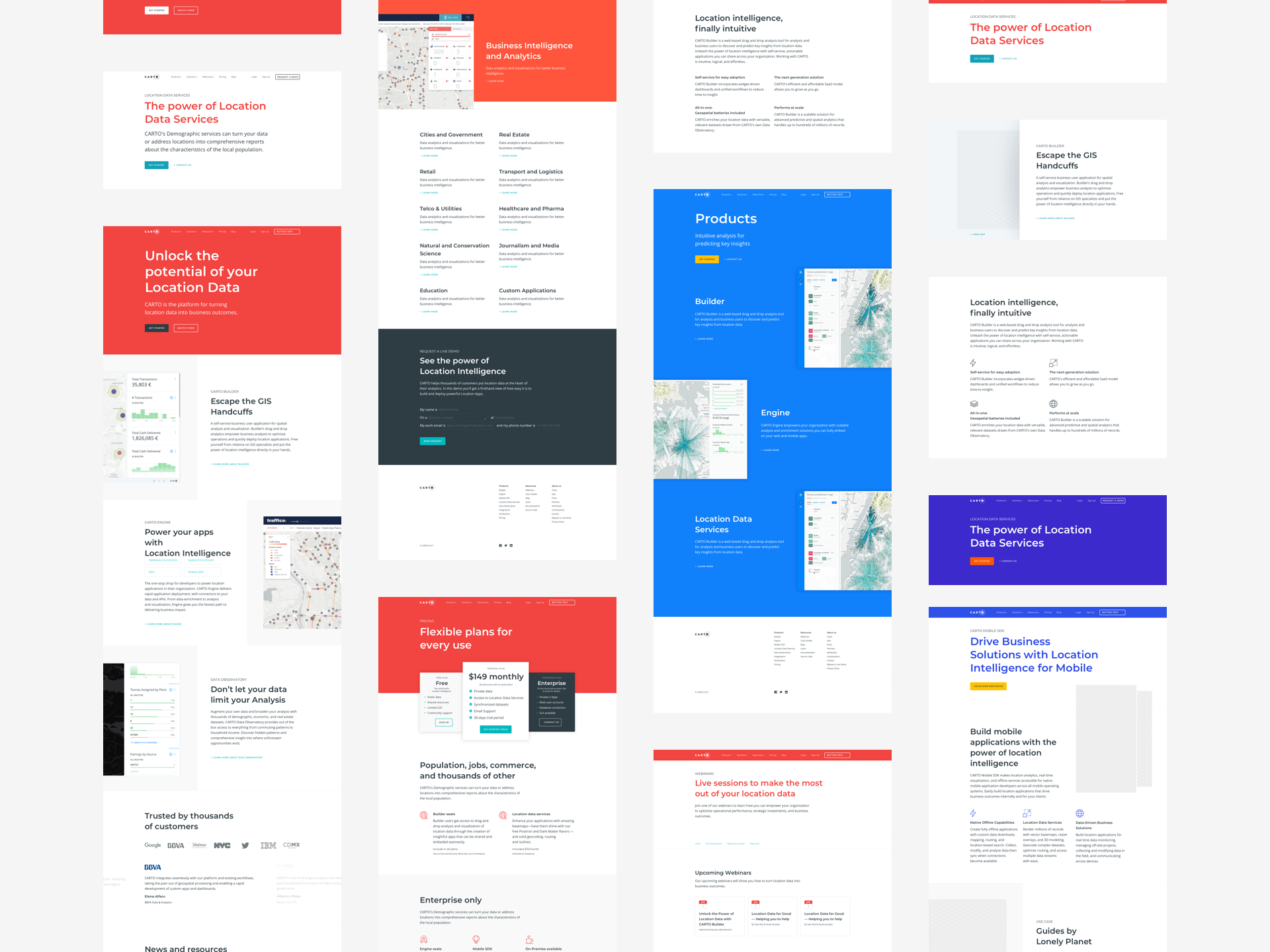
The commercial website is the first contact you have with your future clients and for that, they have to understand the what, the how and how much in the best possible way.

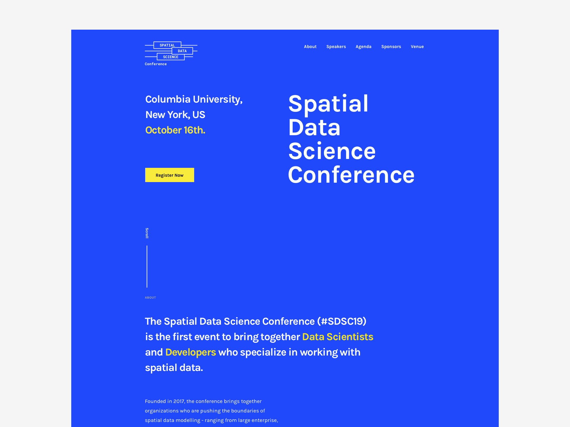
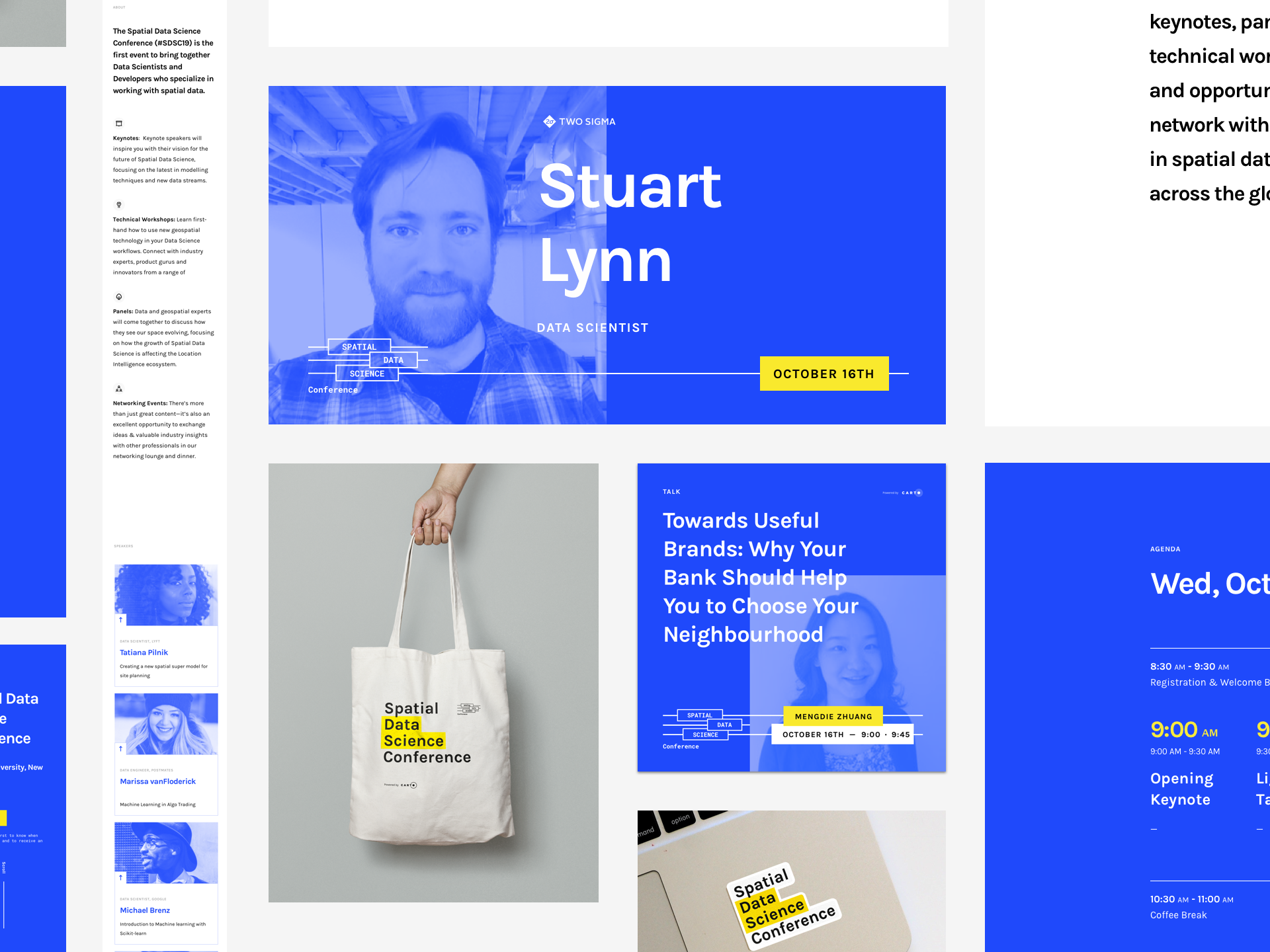
In addition to everything digital, thanks to Carto I have been able to work on projects such as events organized by ourselves. Something that teaches you to work methodically and like clockwork. Thinking outside the screen, in CMYK, in physical spaces, in lights, etc... helps to have many very different points of view and to give the best of you.

UI - Brand - 2018

Legal—Army

The first Spanish NewLaw

Legal-Army is a law firm that has nothing traditional: it is based on the incorporation of new technologies, it does not charge by the hour and whoever wants to work in sports. The team is made up of lawyers who are experts in digital business.

For the brand image, and skipping the "clichés" related to the army, we needed to unite these two concepts and taking elements of justice as a reference, we thought of that balance that keeps horizontality in balance. From there we lowered it until we kept the simplest and clearest expression: The bar -- to then accompany it with a simple sans typography.

Besides for the brand, we thought of a responsive version that could work in the whole social environment, since our morphology was rectangular.

In the design of the website, we wanted to maintain certain cleanliness in the forms, playing with the white spaces and corporate colors. We need to give that more technological and trustworthy air.

Design — Brand — UX — 2017

Bdeo

Visual intelligence at the service of the insurance industry

Bdeo is a video operating web platform. It uses a video call technology aimed at obtaining remotely documentary evidence with the ability to process them through a powerful visual intelligence engine.

The Bdeo symbol represents the turn that the user needs to make with his device when he is doing the survey, in this way the agent on the other side receives the image in landscape format. It represents the action of rotating the device.

We opt for rounded typography that softens the message, gives a more relaxed tone to the conversation. Something necessary since in those moments when you need to report a possible disaster relieves a bit of the tension of the moment.

Design — Brand — App — UX — 2016

Spree

Entertainment & Rewards

Spree rewards your fidelity. Download the app, see what entertainment plans are near where you are, and what rewards I can take if I go to that place.

For the brand we considered doing something with a certain air fun, that could start a smile if we ran into her. Along with them, we went, getting closer to that smile with which we felt comfortable and that Spree breathed.

The palette used evokes direct freshness and novelty, with colors ranging from orange to purple-blue. The two together combine very well with each other and make the brand image stand out.

Concepting - Design - Brand - 2015

Away

Casual Clothes for Soccer Fans

Away is a brand of clothing for football lovers who accompany and encourage their team wherever they go. A brand with which you travel and know the corners of the world. For and by football lovers.

The Away Clothing Symbol is a direct and simple image that refers to the initial letter of the name. The drawing is inspired by the world of football where Away develops: the pitch, the ball, the corner, and the passion.

In it two simple dynamic forms come together; on the one hand, we have the figure of the letter A and on the other the round shape of a football that the two together form the symbol. Besides, from this union, we extract another of the figures from which the construction is inspired: the corner.

The Away logo is the graphic and stable version of its name. It is labeled according to the same logic used in the symbol for the horn of the letter A. This brings the symbol closer to the logo. The typography used is Nexa Black.

It transmits values of simplicity, strength, and actuality. And it guarantees its efficiency through the supports.

Branding - Print - 2015

Román & Raquel

And ate partridges

To commemorate one of the most important days in the life of a couple, these two friends of mine, Roman and Rachel, offered me the possibility of making their wedding invitation.

As good lovers of music, and festivals, from the beginning it was clear to us that the theme, as well as the style, should be focused on those event entries where important information appears, and all with a somewhat outdated style.

Apart from the invitation, a seal/symbol was created with which the couple stamped on the photos that were later taken by all attendees as instant cameras.

Design - UX - Mobile App - Watch App - 2011/2015

Tuenti

Spanish Social network for sharing experiences

The Spanish social network to share with your friends all kinds of content, such as news, thoughts, reflections, photos, etc ... Later, Tuenti took a step to become the mobile operator for all those people who did not find their site among the established.

During my time in Tuenti, I had the opportunity to work with many talented people from whom I learned to understand let product and its cycles, to deal with users from you to you, to share work between different departments, generally to function as a team.

One of my first outstanding projects is the redesign of the Tuenti mobile store website. In addition to selling tariffs and cards (sim), Tuenti Mobile allowed you to buy devices and for this, a model system was created taking into account that the main element was the device. De hay began to build the whole system.

We continued to improve the Tuenti Móvil mobile application by adding features that made it functional. It was designed for both Android and IOS, making their respective assets for each of the resolutions (android). An application to consult your balance, the consumed data, your contacts list and even call any of your contacts to list through voice IP and all this with a chat between your contacts.

The iWatch application was one of the last projects I was involved in. The iWatch was going to be launched in Spain, and few apps were adapted for the new apple clock. In tuenti and we decided that the app store should go out with the app of tuenti, and we set to work to create an app of easy and fast consumption. But in record time, hahaha.

About Juanma Jimenez

Hey there, I'm Juanma Jimenez, Digital Designer living in Madrid creating digital strategies, products, and services. I enjoy exploring typography, family-time, riding motorcycle and disconnection times.

Currently, I'm working as a Product Designer at CARTO. Previously at Tuenti, The Cocktail, HCD, and Zed

Skills and interests
For project inquiries or just to say hello, please do not hesitate to

hello(at)urbanphes.com